RapidRatings is a global leader in financial health analytics, and as a trusted authority, they needed a way to modernize their website to better support user journeys without undertaking a full rebrand or rebuild. The goal was to make strategic UX and design enhancements that would help users find key information faster and ultimately increase qualified sales leads.

Through a focused UX audit (completed in under one sprint) and review of prior brand discovery work, I uncovered several core areas to improve:
I collaborated with the in-house designer to expand and refine the existing design system:
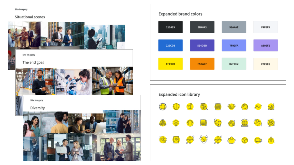

RapidRatings had a limited set of page templates, resulting in a website that felt monotonous. To address this, we:

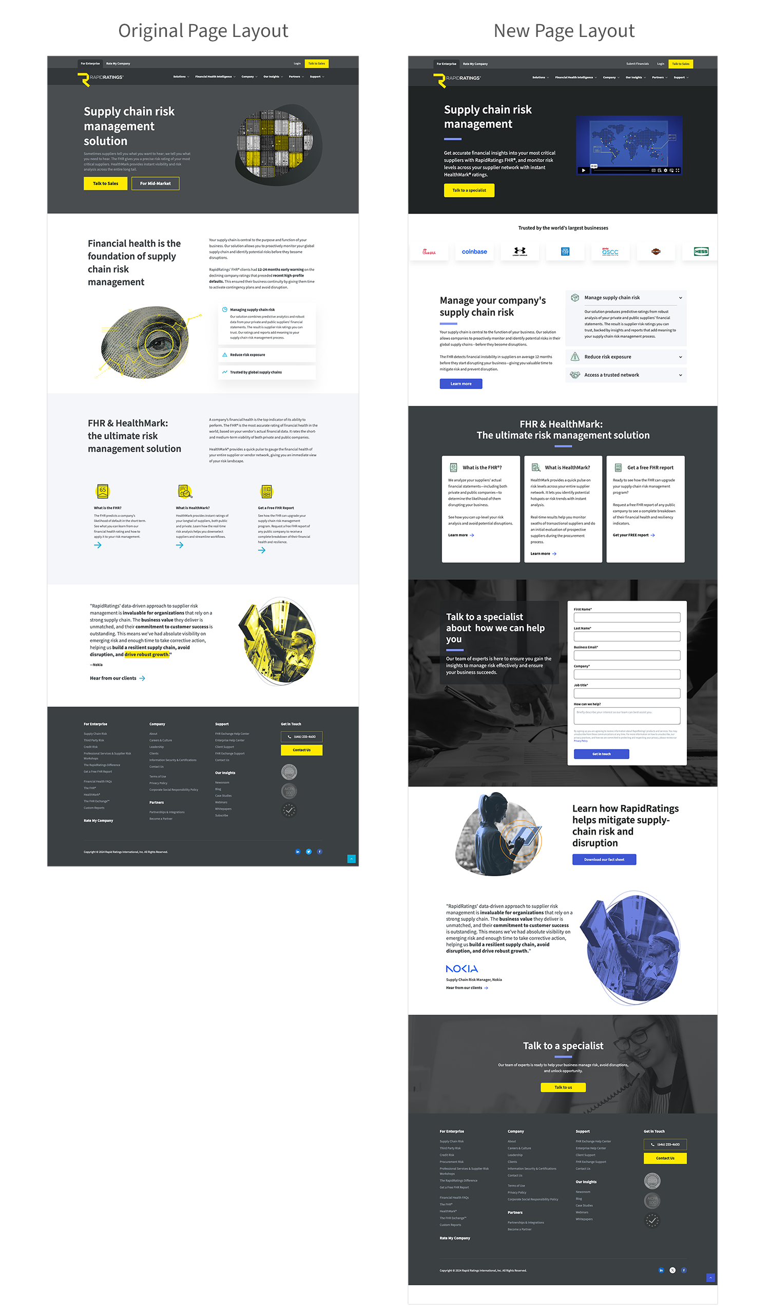
Using the improved design system, I developed multiple high-fidelity page templates that addressed previous usability and branding challenges.
Key improvements:
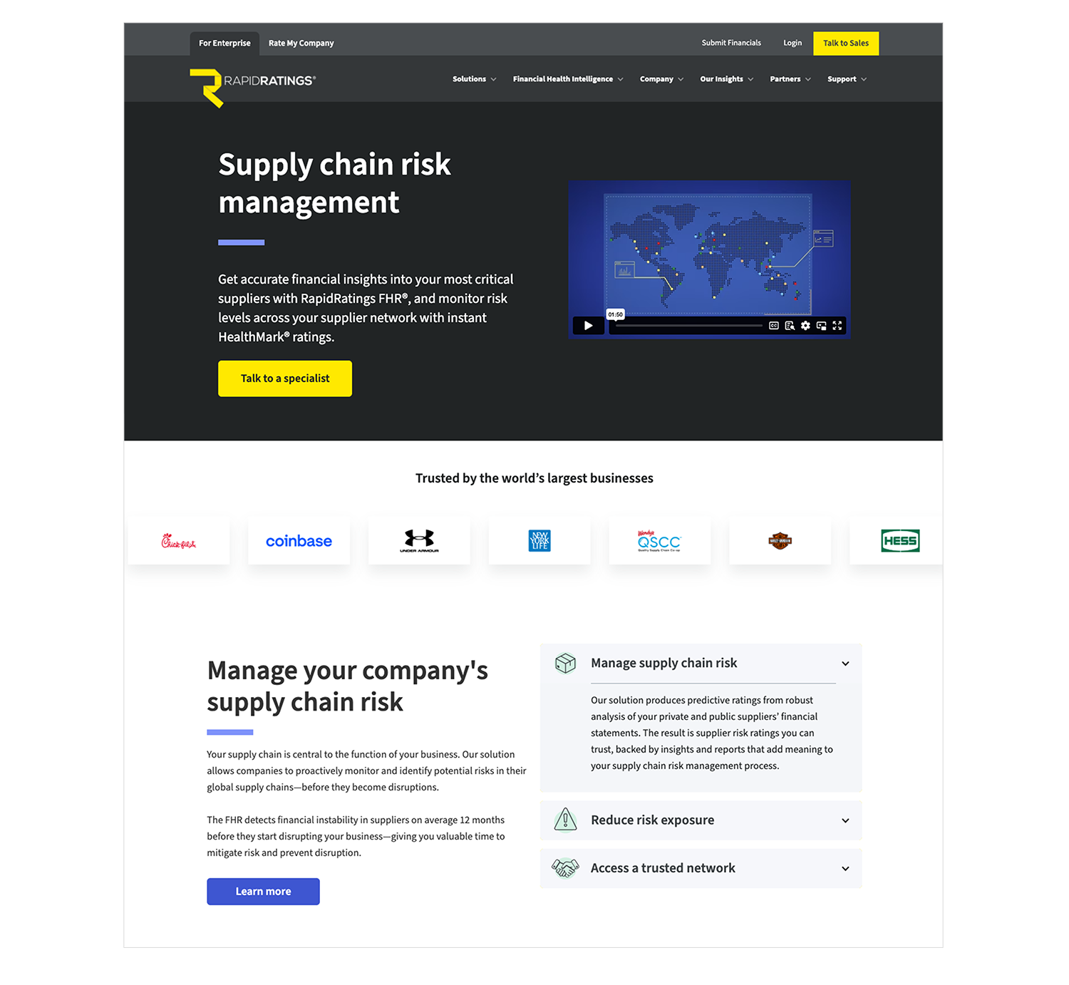
Top of Page
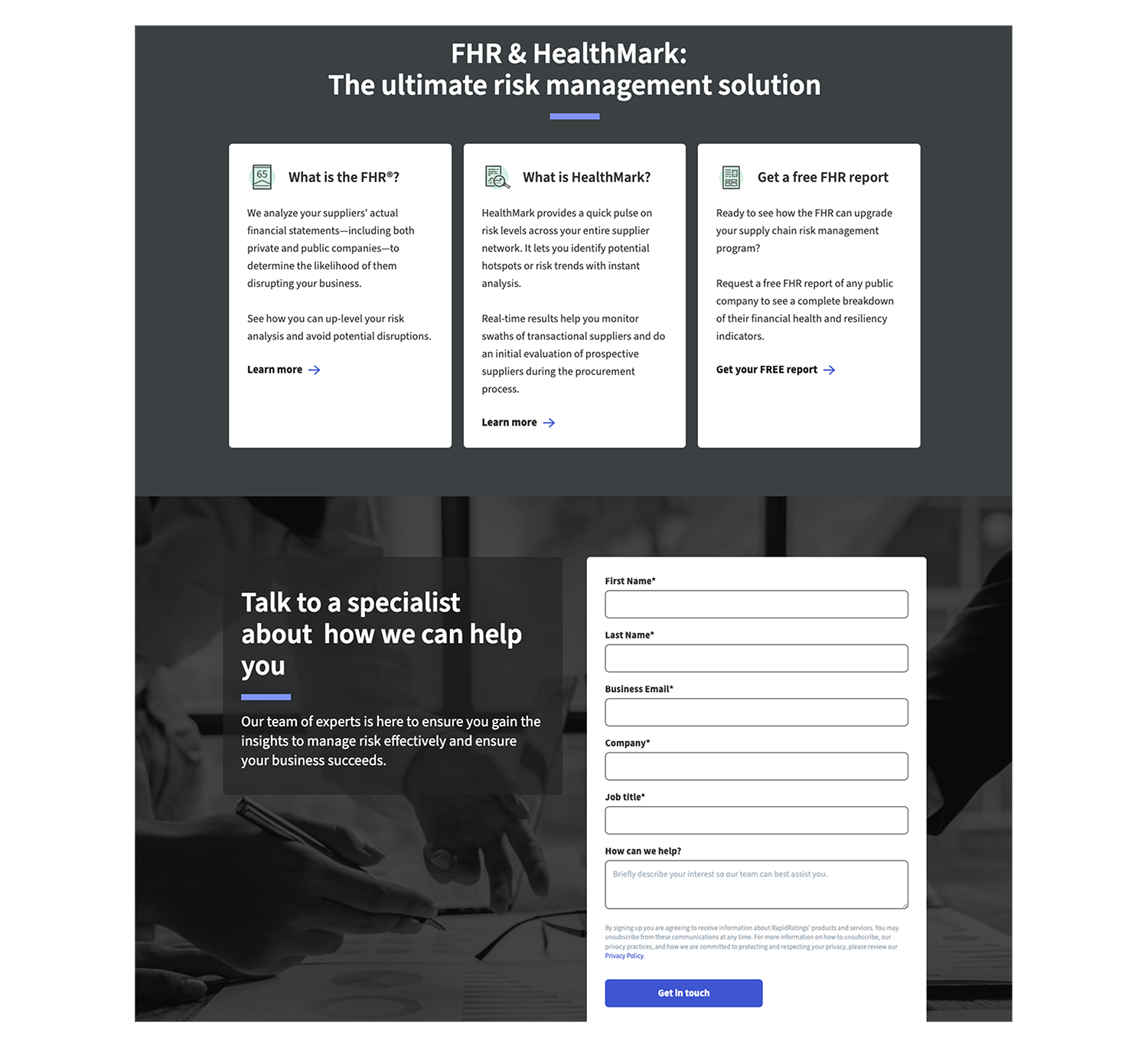
Mid-page Content Blocks:
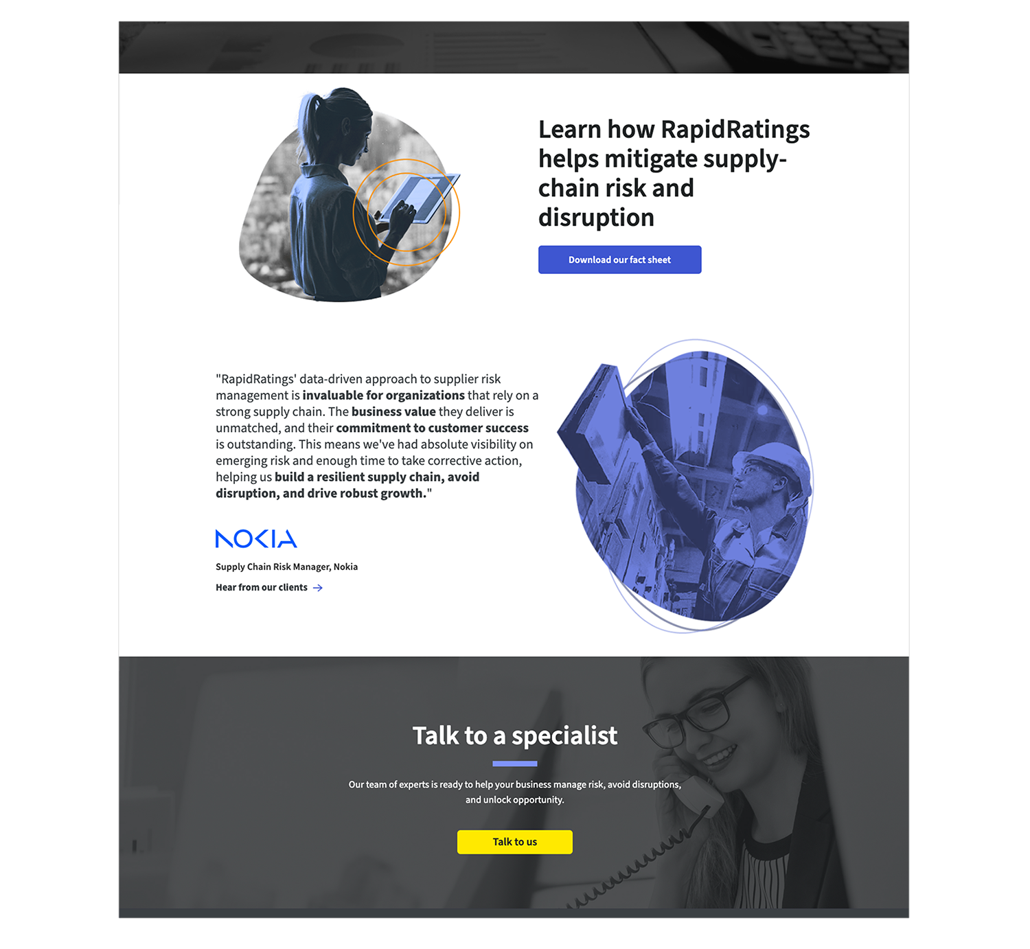
Testimonials:


After launching the updated site, RapidRatings reported an immediate uptick in lead conversions. They are currently compiling detailed analytics, which will inform future optimizations. We’re now in discussions for a longer-term engagement, potentially leading to a full redesign.
College Board’s Advanced Placement (AP) program enables over a million high school students annually to earn college credit through their courses and exams. Behind the scenes, thousands of internal staff and external contractors work together to write and review AP exam questions using College Board’s proprietary content management system, Hummingbird.
While Hummingbird had a commenting feature, adoption was low. Many users opted for external tools like Word or email to collaborate, creating fragmented workflows and communication bottlenecks.
The product team, which consisted of our PM, a lead designer, and myself, was tasked with improving the in-app commenting experience in time for the next authoring cycle. We had roughly three months to investigate the problem, validate ideas, and design an improved experience.
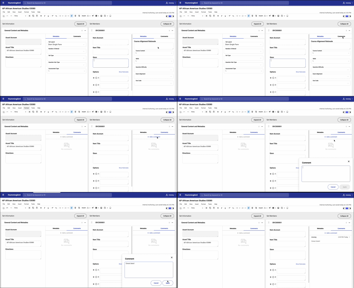
We began with an audit of the current commenting functionality and quickly identified limitations:
We suspected the lack of visibility and integration with workflow was contributing to low usage, but we needed deeper insight.

To move quickly, we facilitated a 3-day design sprint with Hummingbird users across roles (authors, reviewers, managers), as well as engineers. We needed to understand user needs, validate assumptions, and define an MVP feature set.
We asked users to imagine what their ideal use for comments could be, and uncovered the following issues:
These insights shaped our priorities and helped us create an MVP feature list:
Must Have
Should Have
Could Have
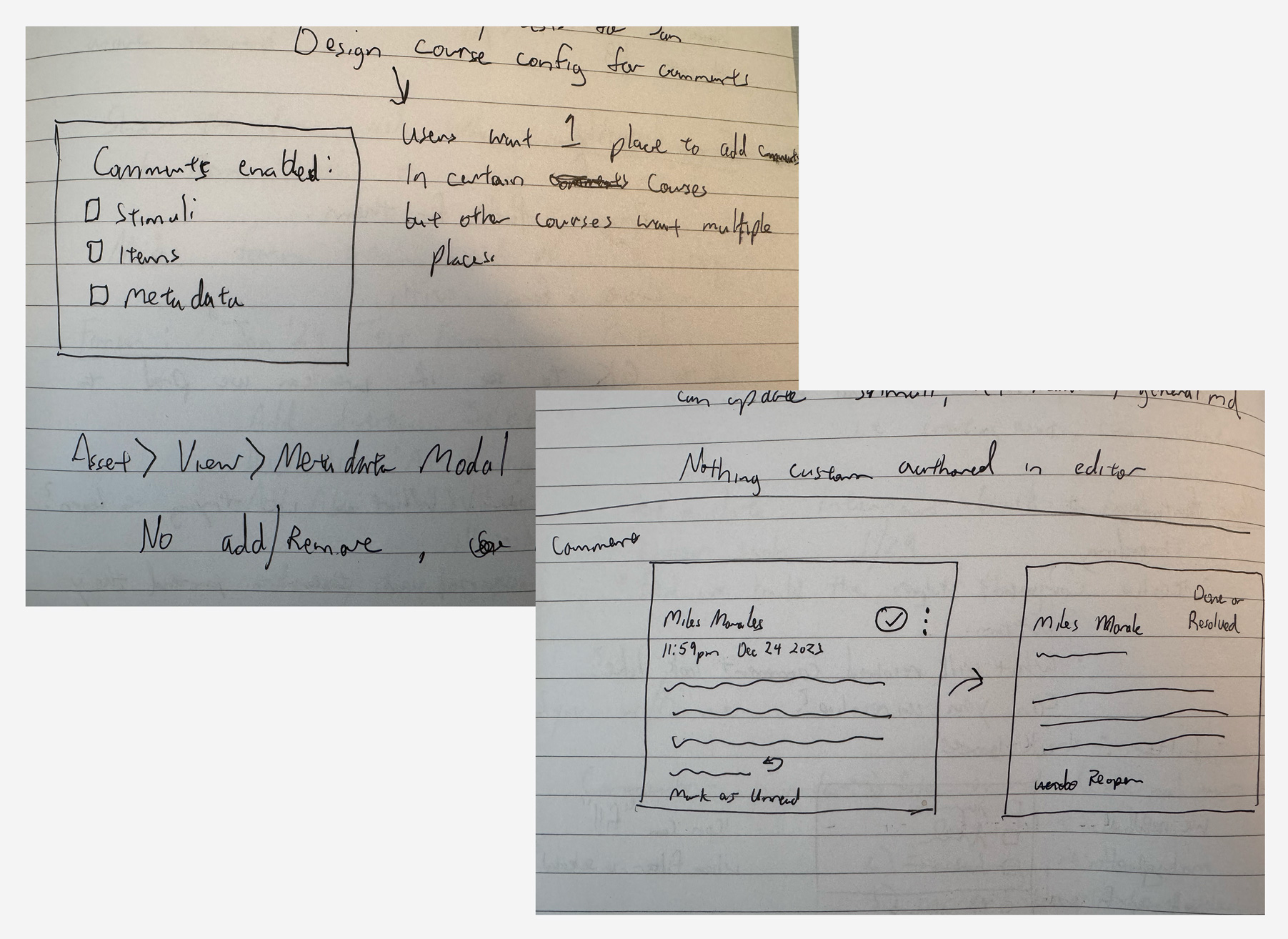
I led early concept exploration and UI design, sketching a few approaches before developing high-fidelity prototypes, with key elements including:
We held regular design reviews with stakeholders, engineers, and peers, and their feedback helped balance ambition and feasibility. For example, we simplified threading after concerns about over-engineering and deprioritized lower-impact features like user role tags for a future release.
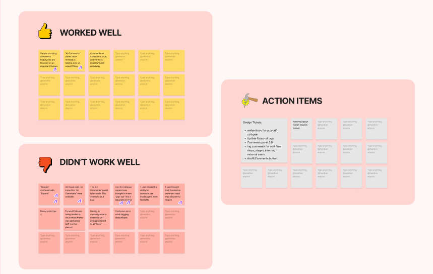
Since we had already conducted some user testing during the design sprint, our team decided move forward with design and development started once we had stakeholder approval on a high-fidelity prototype. But because this would be a heavy lift for our engineers, we tested our prototype with three of Hummingbird's power users before development. Findings included:
We used these insights to make some adjustments to our mockups before sending it to production.
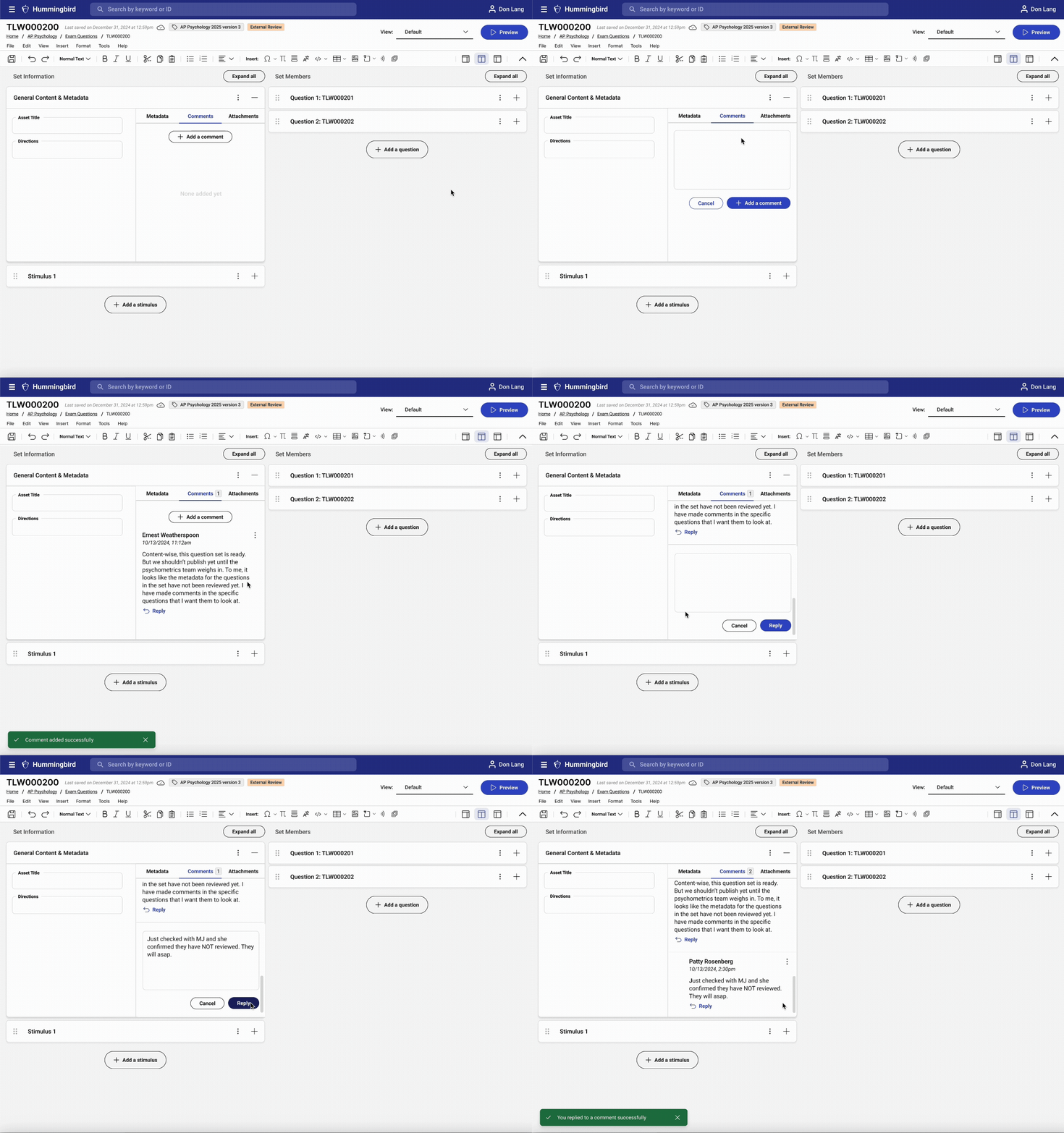
Users can now write comments directly in the part of the question they want to address. They can also reply to a question, starting a threaded conversation.
Resolving and archiving comments, while important, would have pushed the release out, so we decided to include them in the 2.0 release.
Users wanted more information about the commenters (such as their role) but that also would've pushed the release out, so we decided on other solutions like filtering out internal and external users in the next screen.
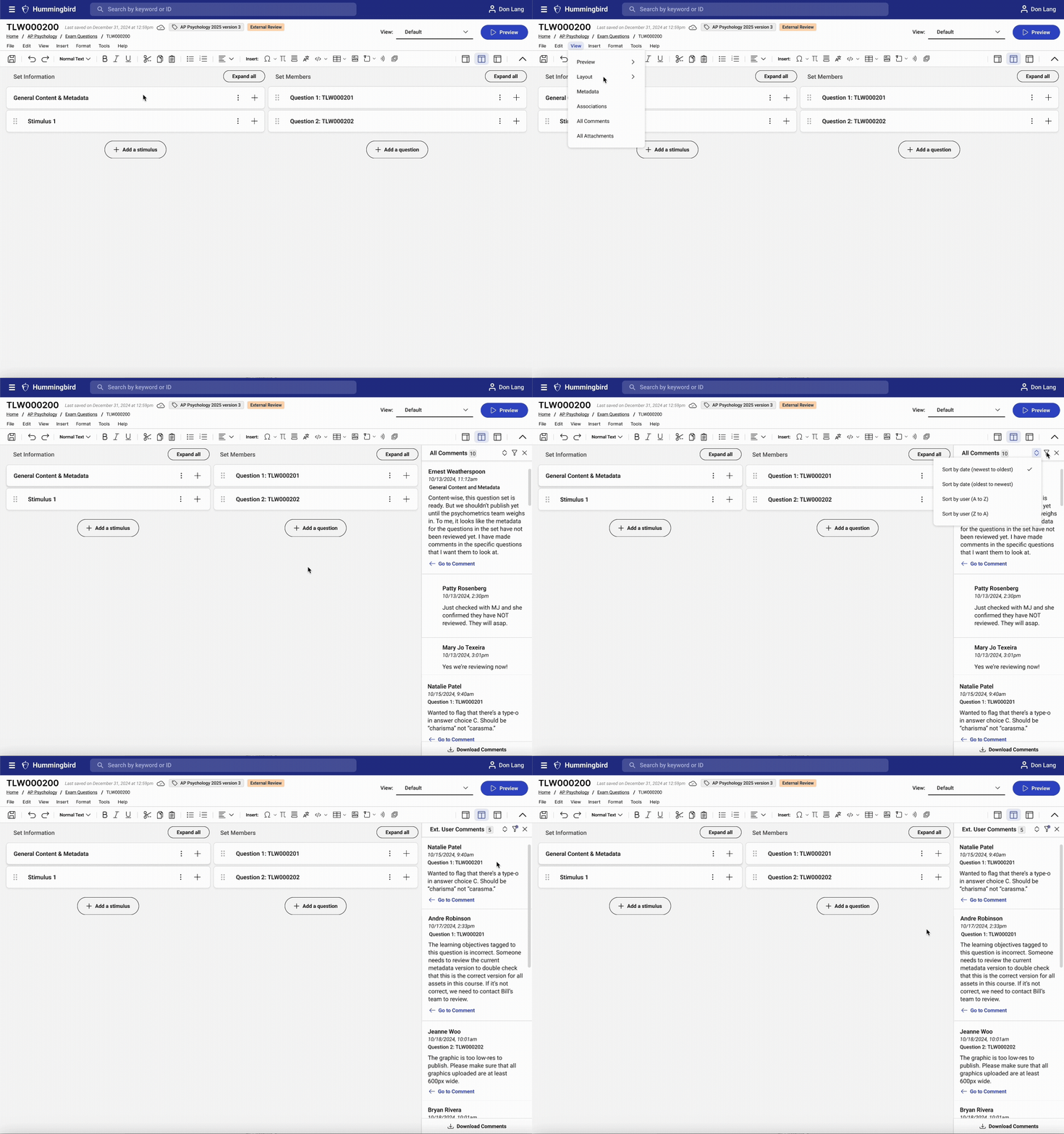
Our filtered, searchable side panel gives teams visibility into the status of conversations at a glance.
Since we couldn't add user roles, we did create a filter that lets them see comments from internal (in-house) and external (contractor) users. This was a compromise that worked for everyone – the AP team can keep their comments separate and confidential (external users don't have permission to view them) while dev met their delivery timelines.
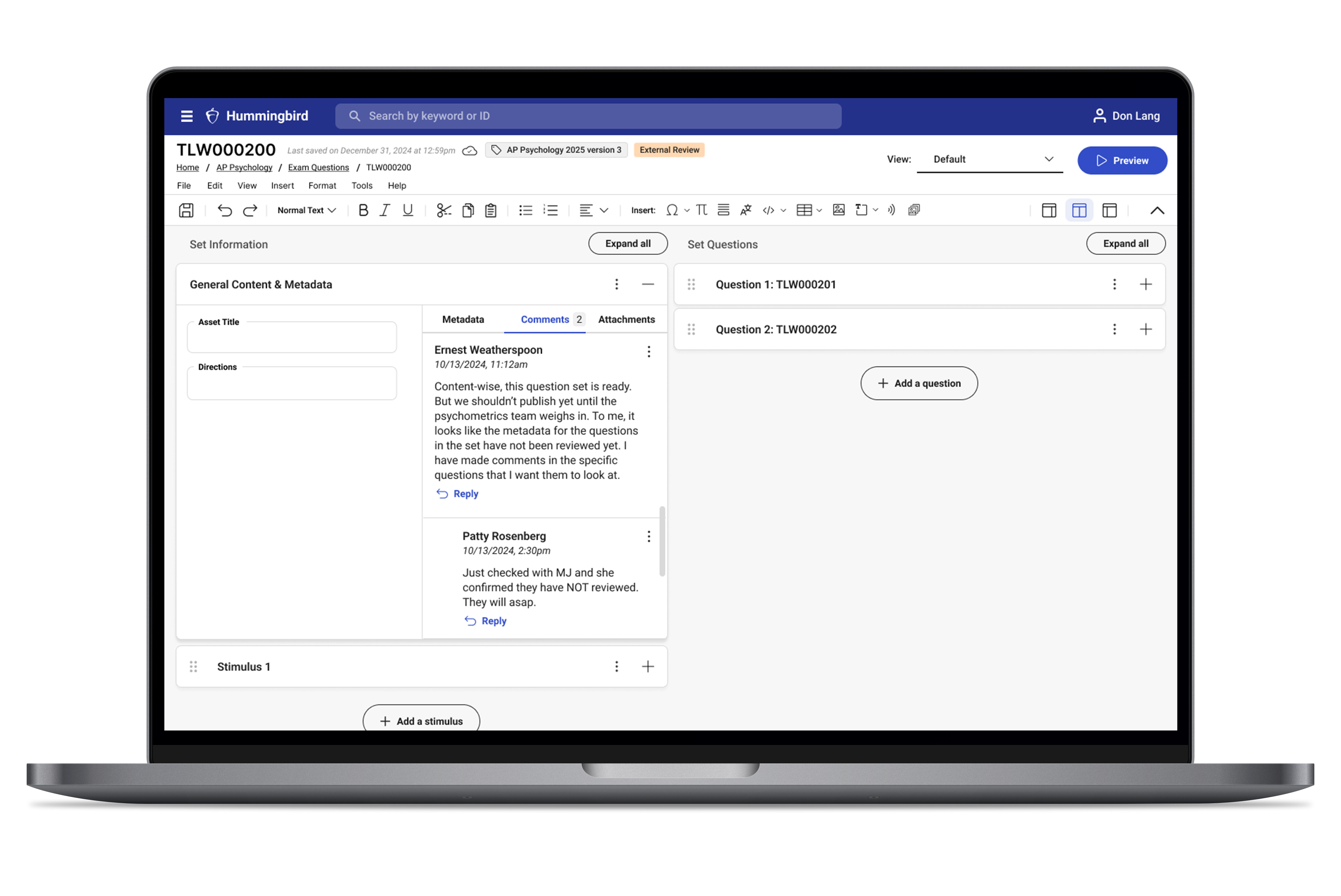
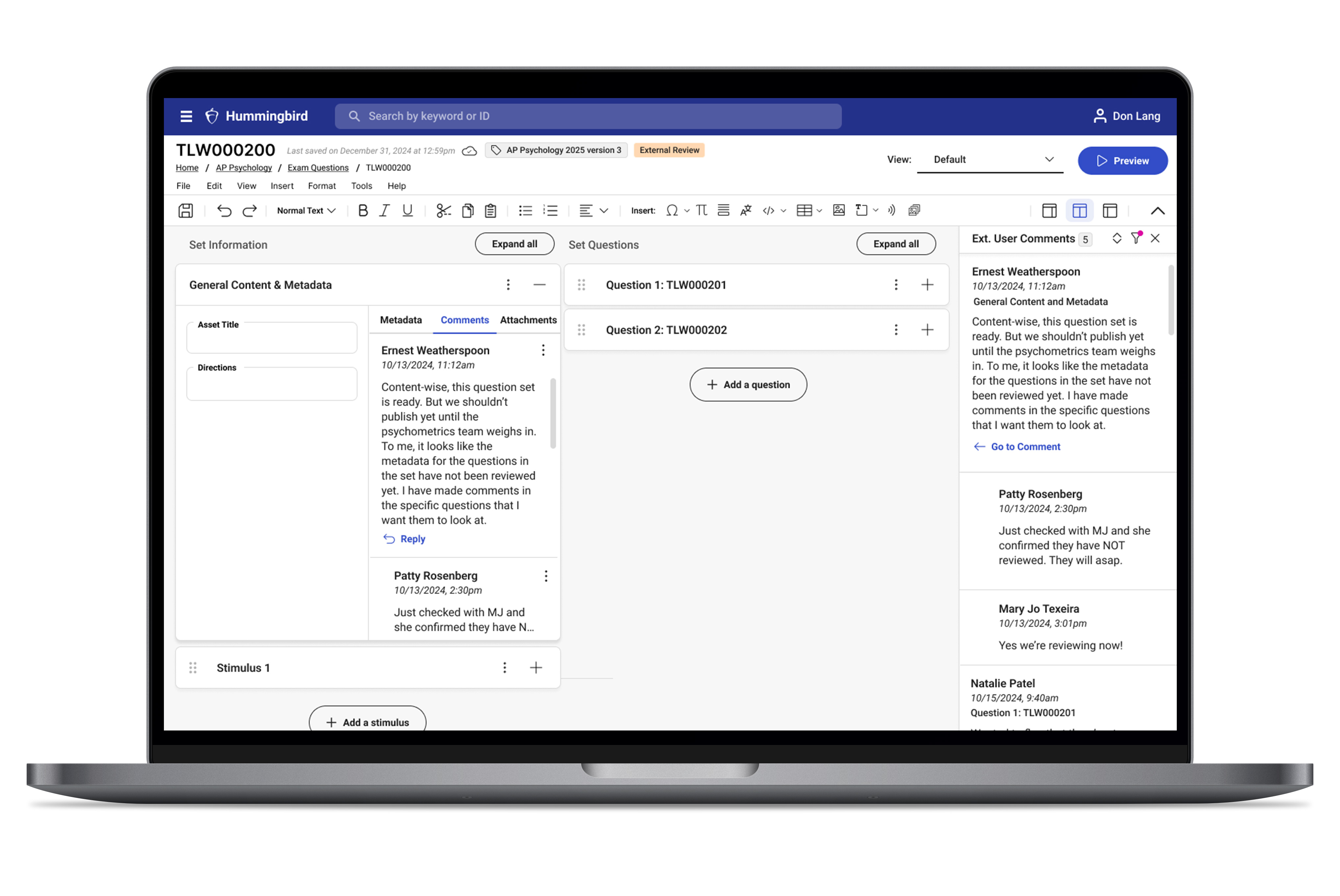

Shortly after release, our PM received this note from the Director of Operations at AP:
"My team and I love the new improvements to comments. Threading will help organize all of the conversations going on and the "all comments" panel gives us a clearer view of where we are in the question authoring process. Great work!"
We were thrilled that the new features we designed made an immediate impact for our users. Since the initial release, we have seen a 50% increase in usage across both internal and external users in all courses. With the 2.0 release we provided users with even more enhancements, like internal/external user tags next to their username and the ability to resolve comments and archive threads.
Now one of Hummingbird's most used features, this project not only improved cross-team collaboration but also fortified our design process for future app enhancements.
Amber Waves is a Long Island–based farm that supplies produce to restaurants in New York City and operates an on-site market and restaurant. To manage a growing volume of wholesale orders, the team launched a custom online ordering app. However, many customers continued to place orders via email or text, creating operational bottlenecks for the wholesale manager. I was brought in to evaluate the app, understand barriers to adoption, and improve the user experience, without disrupting the systems the team already relied on.

Amber Waves built their initial app with speed and function in mind, but some critical features were missing. Most notably:
These limitations, combined with the highly personalized nature of their customer relationships, led many users to bypass the app entirely.
I conducted interviews with both staff and users to uncover the root causes of low adoption.
Isabel Mulligan – Field & Wholesale Manager
Jack Formica – Head Chef, Amber Waves client
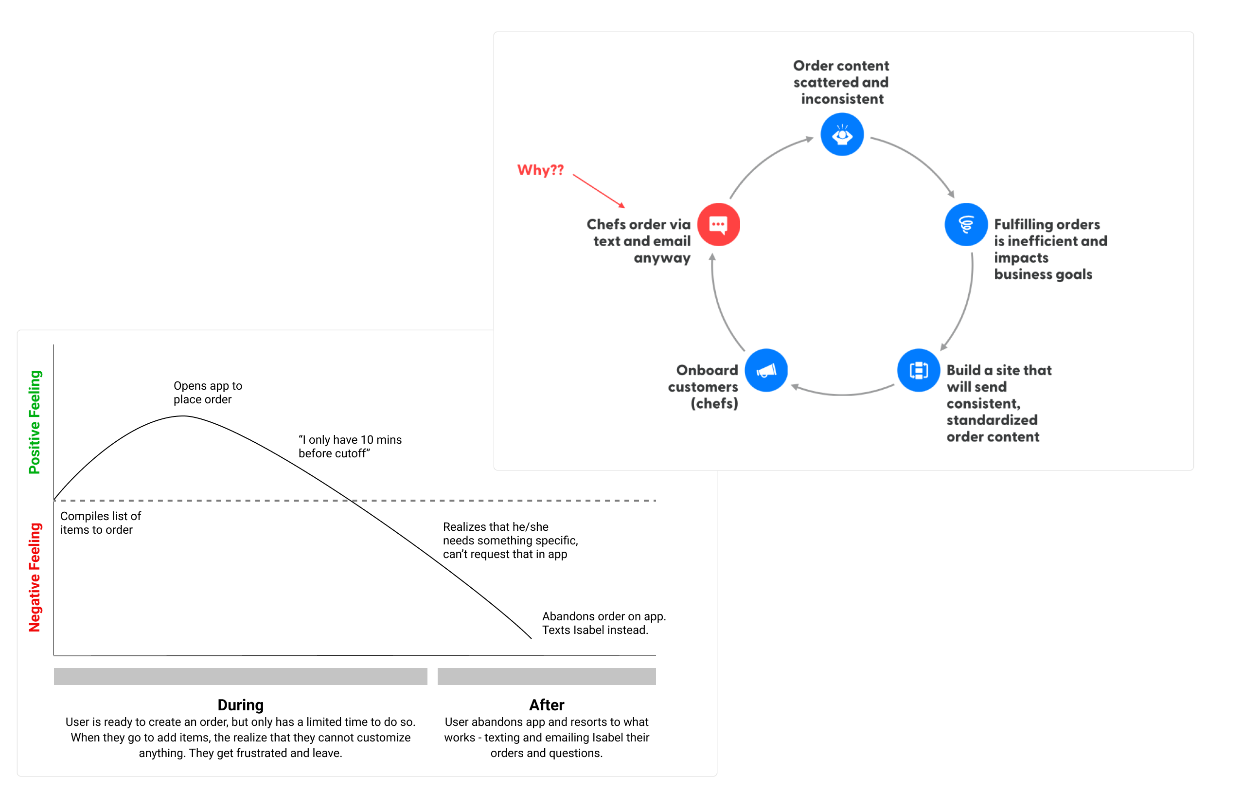
Users didn’t feel confident that their special requests would be seen or honored through the app. Without the ability to add notes or customizations, users defaulted to texting or emailing staff directly. Once I came to this conclusion, the challenged shifted to redesigning the app to support nuanced ordering while keeping the core experience familiar and staff workflows intact.

I mapped out user personas and ideal flows, aligning with both customer needs and internal business goals. Two features rose to the top:
These changes would allow users to rely fully on the app while streamlining fulfillment for the staff. Meanwhile, we decided at that time to not integrate a payment feature on the app. The consensus was that many customers preferred to pay on delivery and more user adoption was needed before introducing such an enhanced feature.
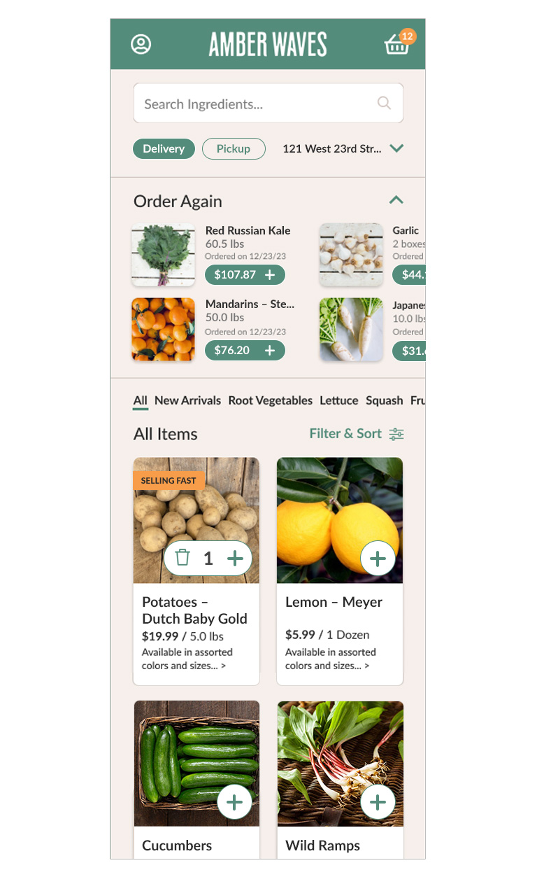
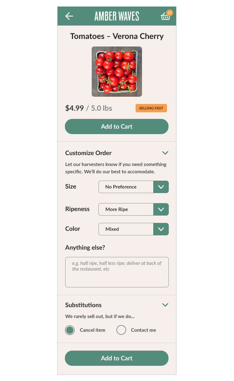

Clearly Displays:
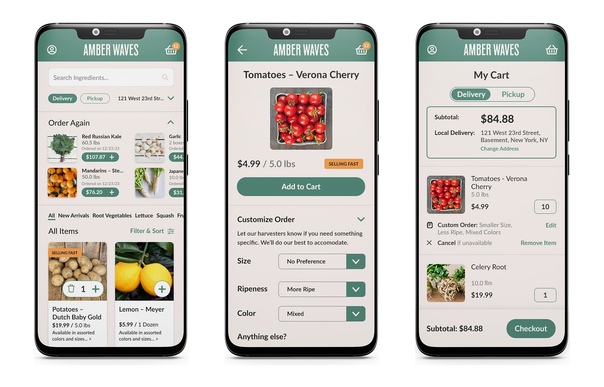
Within weeks of launching the redesign:
Design Buddies is an inclusive community of 30,000+ designers from around the world, to learn, hang out, and meet peers. It doesn’t cost anything to join and is open to anyone. It's a great place to get quick advice and feedback from other designers and peers via chat, but there is a growing demand within the community for members to find expert mentors “on demand” to answer more specific questions in detail. So, they built a separate app called Mentor Buddies, where members can find an expert to chat with in 15-minute private sessions in exchange for donating to the mentor’s chosen charity.
However, early beta testing revealed that although interest was high, the number of users who actually signed up for sessions were underwhelming. Their product team brought me on to help them make improvements to their onboarding process to increase conversions.
Reviewing their onboarding process for the first time, a few things really stood out to me. I thought the topic choices were too broad and the level of commitment was very forward heavy, such as creating a profile or verifying a phone number. Though the mentor profile was helpful, it didn’t share anything about their personality or include any sort of user rating system.

Despite enthusiasm from the community, Mentor Buddies hasn’t seen a lot of engagement. When I asked Grace why, she gave a few really good reasons to dig deeper into. She didn’t think the initial onboarding screen asked enough questions, so users would fear that the system wouldn’t match them with an appropriate mentor. Then, when they got to the mentor list, there were too many choices, leading to decision fatigue and a sense that it wasn’t personalized enough.
Of the ones who did chat with mentors, they had very positive feedback about their experience, and some even wanted to sign up for more sessions or longer sessions. The idea worked, but how do we get more people to sign up for their first session?

I asked the product team for access to their data and analytics, including task completion rate vs. drop off rate, and heat maps. The data confirmed a few assumptions I had, especially that the most drop-offs occurred during profile creation.
The team ran usability tests with a few participants, and I worked with them to help organize their feedback into an affinity map. Although it was immensely helpful to have specific comments for each screen, our map helped expose the larger problems users were having with the onboarding process, namely that there are not enough topics which makes search results too broad, profile creation happens too early, and that there is not enough information about the mentor on their profile page to commit to a session.

It became clear that the users, who were already skeptical of limited topics to choose from and the early profile creation task, didn’t feel confident that the mentors in their results would be helpful. We knew that even those who were highly motivated to find a mentor were ultimately discouraged by the lack of information on the mentor’s profile page as well.
Therefore, we set out to reorder the onboarding process to make it easier for users to find matches, and redesign the screens that were most problematic, starting with the topics screen, match list screen, and profile screen.
We decided to place the profile creation and verify phone screens at the end of the flow, so that users would have a chance to view mentors going through the work of setting up an account. They would be more likely to create a profile if they’ve reached this stage.


We broke topic selections down to several screens in order to refine the user's interests and match them with better mentors. We used visuals as well as copy to guide users through the entire process.
Many users felt overwhelmed with choices, so we decided to give their matches some visual hierarchy. The first (and most closely) matched has her profile preview open by default, while the others has theirs closed. We also added filters for easy searching.
For the open preview, we will show the mentor’s user ratings, number of people she’s currently mentoring, a brief profile statement, and a her expertise. Users can “Chat Now” or “View Profile”.


“Matched Interests” assure users that they matched with the right mentor.
Mentor profile gives users idea of her’s professional achievements and a peek into her personality. This is critical for an effective and enjoyable session.
Reviews are now a horizontal scroll to cut down on vertical space, though users can opt to see all reviews at once.
The “Donate” section remains the same, but the CTA changed to “Create Profile and Start Chat.”

Once the user requests a chat, they will be taken through profile creation, where they'll be asked for basic information, then to verify their phone number and enter payment info. Once that is complete they will be taken to the chat.

In limited testing, the results showed great improvement on drop off rates. We are currently talking to development to see how long it will take to implement these changes, but the Mentor Buddies team is very eager to work with me again to help further optimize their onboarding process and to help modify and improve the rest of their app.
Northwestern Mutual, a financial services company, needed to overhaul their “Find an Financial Advisor” workflow on their website to not only match their new rebrand aesthetic, but make it more user-friendly and modern. For this project I worked closely with product managers, engineering, and marketing to revamp this feature.
Observing the friction between different teams while working on past projects, I recommended that a developer from engineering should be present at our kick-off meeting. While some stakeholders thought it was not necessary, I eventually convinced them that looping in development at this stage would reduce production time in the future since they can provide insight on our ideas and solutions. This strategy would prove to be critical to this project's success in meeting its deadline.
Among other insurance companies, most do not have elegant forms to draw inspiration from. However, my team and I really loved the Oscar Health’s policy match form for its simplicity and sleekness. The form presents one question at a time, though they keep it short at four (very basic) questions so as to not overwhelm their users. We also liked how your previous answers are grayed out so you can see your information.

I presented a few options to stakeholders, who eventually chose the one below. While almost everyone liked Oscar’s policy match flow, we ultimately decided on a layout that displays all the questions at once, since matching with a financial advisor would require more information from the user.
However, we did decide to feature one question on the landing page which has a drop down menu. We felt that the user’s goal was the single most important data point for this tool and wanted to highlight it accordingly. We also went with a drop down rather than a free type form to accommodate for the database we were working with.
To make the form more friendly and conversational, we laid it out as a paragraph.


The page hero includes instructions broken down into 3 steps for users.
Users start with a single question - the most important question. After selecting an option from the drop down, users are then presented with 7 more questions as a friendly 'fill-in-the-blank' statement or "Mad Libs" format.

With the engineering team present from the start, handing off was simpler than ever. The feature launched a few weeks after the new branding was introduced, and provided Northwestern Mutual's customers with a more approachable way to find an advisor for their biggest financial goals.
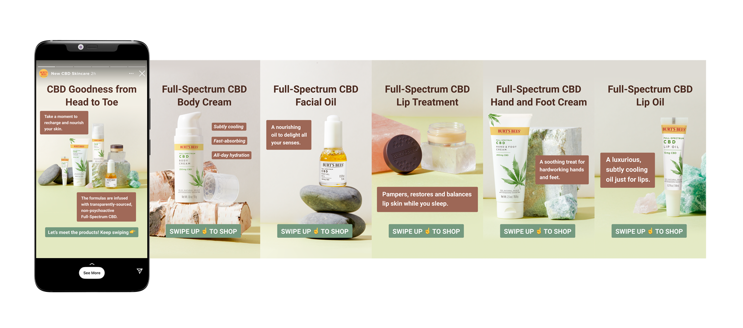
Burt’s Bees, a leading beauty and skincare brand under The Clorox Company, planned to launch a new product line in Fall 2020 centered around cannabidiol (CBD), a highly anticipated yet polarizing ingredient. I was brought on to lead the digital experience for the launch, including the creation of a direct-to-consumer e-commerce microsite and the supporting digital campaign.
Working closely with marketing, product, UX, and engineering, our goal was to introduce CBD in a way that was educational, trustworthy, and aligned with Burt’s Bees' all-natural, socially responsible brand voice.
Though CBD had become more accepted in wellness and beauty circles, it was still a by-product of marijuana, something that elicited mixed feelings among internal stakeholders and, likely, customers.To strike the right tone, we focused on transparency, education, and approachability. Instead of distancing the brand from CBD’s origins, we leaned in, treating it as we would any other ingredient — highlighting its natural benefits while dispelling myths about psychoactivity.
Through multiple workshops with cross-functional teams, we identified key messaging pillars:
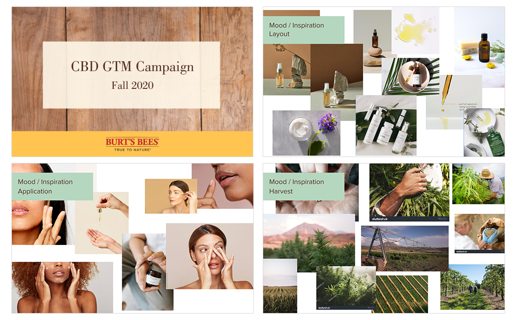
I led the moodboarding process, exploring competitor positioning and ideating creative directions around sourcing, application, and wellness. These themes shaped everything from copy tone to visual direction.
To align stakeholders and organize content strategy, we developed a site map early in the process. It served as both a planning tool and a visual guide for internal presentations.

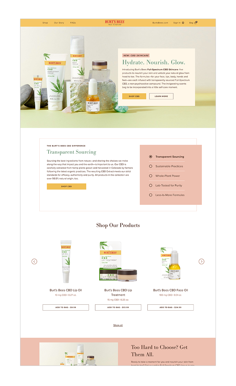
The product team had a rough structure in mind, but I helped refine and wireframe the full experience, from homepage to product detail pages. While e-commerce flows often follow standard patterns, we identified opportunities to make the experience feel more editorial and immersive.
Example:
On the Shop All page, we moved away from a standard grid layout and embraced a magazine-style aesthetic. This allowed us to layer in storytelling (like skincare routines and ingredient education) directly within the product listings.

Accessibility was a top priority for Burt’s Bees. During weekly design critiques, I collaborated with product and UX leads to ensure ADA compliance:
These checks helped ensure the experience would be inclusive and fully accessible from the start.
Once designs were approved, I partnered with the copywriter to shape the content across all pages. I also coordinated closely with the art director managing the product and lifestyle photoshoots to align visuals with the site’s editorial tone.
With a tight launch timeline, it was critical that design, content, and development moved in sync. I created final handoff files with detailed annotations to ensure a smooth build for engineering.




HCL Software needed to promote a key feature of Volt MX Go, their modern low-code development platform. The goal was to encourage remaining Lotus Notes users to migrate their legacy apps and transform them into modern, multi-channel experiences without the cost or risk of a full rebuild.
The audience was highly niche: IT professionals and developers who were still maintaining outdated Lotus Notes apps. This campaign needed to be sharply targeted, creatively compelling, and executed fast.
With only 4–6 weeks from kickoff to delivery, we had to move quickly and efficiently. While collaborating with product marketing and content teams, I jumped straight into developing creative directions, mapping user flows, and partnering on key messaging points.
User feedback made one thing very clear: Lotus Notes users weren’t loyal, they were stuck.
Surveys revealed frustration across the board:
These insights guided our approach: position Volt MX Go as the escape route—fast, low-risk, and future-proof.
Most users would be driven through the following funnel:
Social / Email → Landing Page → White Paper Download → Contact a Migration Expert
This journey needed to be backed by creative that immediately resonated with pain points and gave users a reason to act.
I developed three campaign directions, each with its own pitch, moodboard, and example social assets in order to explore different emotional and functional appeals while aligning to brand tone and business goals.
The Pitch: We’ve all been there—working late, caffeine-fueled, under pressure. The deadlines looms, and the tools don’t help. Imagine how much smoother it would be if you weren’t stuck on Lotus Notes.
Volt MX Go. Get Unstuck.
Tone: Empathetic, gritty, personal
Visuals: Dim office lighting, time-lapse imagery, tired eyes and glowing screens

The Pitch: Some things age like fine wine. Technology? Not so much. Once ahead of its time, Lotus Notes is now a burden to maintain. Volt MX Go makes modernizing seamless, so your apps are future-ready without the growing pains.
It’s time for the future. It’s time to GO.
Tone: Smart, honest, reassuring
Visuals: Split-screen contrasts (then vs now), comparing the old and new

The Pitch: Whether you're maintaining race cars or enterprise software, old tools slow you down. The tech world moves fast, and if your apps can’t keep up, you’ll get lapped.
Turn your apps into frontrunners with Volt MX Go.
Tone: Energetic, confident, forward-looking
Visuals: Racing themes like pit crews, runners at the starting line, cyclists breaking ahead

While all three directions were well received, “It’s GO Time” resonated most with stakeholders. It captured the energy of the product, the urgency of migration, and the transformation story behind Volt MX Go.
We expanded the racing motif to include track & field, cycling, and auto racing, giving the visuals a broader and more inclusive feel. Once approved, I finalized campaign visuals and handed off assets to the dev and media teams for deployment.


After years of silence, HCL Domino v12 marked the first major release of this enterprise platform since its acquisition from IBM. With millions of loyal users worldwide, many of them had stuck with Domino through decades despite minimal updates. This was more than a product launch. It was a long-awaited revival.
Our goal was twofold:
And, since this was 2021, we were still in the throes of the pandemic and needed to do it all virtually.
As the lead designer, I collaborated with the product owner, content writers, and digital strategists to shape the creative direction of the campaign. Our audience was global, nostalgic, and technically savvy. To match the scale of the moment and the energy of the community, we designed a live, day-long virtual event filled with:
To pull this off, we partnered with a virtual production company to build an immersive experience—complete with themed breakout rooms, community chat spaces, and live streaming capabilities.
We leaned into the retro tech aesthetic, especially for swag.
Each attendee received a custom event box with:
To overcome Zoom fatigue and maintain attention:
Despite pandemic constraints and short lead time, the launch event successfully reignited interest in the platform and mobilized a passionate user base:
4.3k registrations
1.5k live attendees
1.8k playbacks
40 qualified leads for new enterprise clients
I designed and built an interactive site for users to register for the launch event. Working on Ceros meant our engineers could focus their attention on updating and improving HCL Domino's site.


Leading up the the launch, we published blog articles outlining the benefits of upgrading. Here are a few examples.


Animated teaser videos promoted on social channels to generate hype for the event.
A few examples of the swag we mailed to attendees.


Manchester United asked me to explore designs of their U.S. ecommerce store for an entirely new product line - one of high-quality fabric and refined tailoring meant to appeal to a more upscale audience - called M.U.F.C. Although this new line of clothing will still include sportswear and be closely tied to the soccer team (they made me call it ‘football’ at their office) it will also feature trendy, fashion-forward styles and tasteful branding.
The marketing team made it very clear that they want an upscale web store that moves away from the organization’s team store, and asked me for an idea of what the customer experience would be like.
At the time, many professional sports teams with large fanbases, such as Real Madrid, the New York Yankees, and the Los Angeles Lakers, do not sell branded lifestyle wear. Of all the top athleisure brands that were relevant during this phase…
Puma would be MUFC’s closest competitor, it has both fashion and sportswear brands, as well as links to the teams that they sponsor, such as Arsenal, Borussia Dortmund, and Italia.
Adidas has products that are meant to be work as fashion pieces, but they are not featured prominently. They also do not do cross-branding with any pro teams.
Nike is mostly known for their athletic products, though they do a great job of tasteful logo placement.
Lululemon has a robust collection of work-to-workout products that are both stylish and functional, but do not do cross-branding with pro teams.
After taking some time to brainstorm ways to deliver the message, I developed 3 concepts that took different approaches, created pitches and moldboards, and mocked up a few social ads to show how they would look in the wild.


Using best practice design principles, I laid out wireframes for what their site could look like.


This series of cinemagraph emails kicked off in Fall 2016. We wanted to show our users what is possible with beautiful premium content available at OFFSET.
Our interactive Fashion Week email was also featured on the email marketing design site, Really Good Emails.
Animated emails that serves as both an announcement and demo of new products.
In the summer of 2016 a few designers and I were asked to design a digital poster for the blog with subtle, "cinemagraph" animation. The theme was retro-inspired travel posters of hometowns of movie villains, and I chose Star Wars' Darth Vader's home planet, Tatooine. This poster was made entirely of images and footage found on Shutterstock, to highlight the depth of their collection.


Working with a designer/animator and a product marketer, we produced an explainer video that discusses PSD2 regulation and Forter’s solution.
A few examples of the interactive landing pages we were producing as demand gen assets.


